
Brand Book Essentials: 8 Things Every Brand Guidelines Document Needs
A brand book, also called brand guidelines, has eight essentials: logo rules, colour codes, fonts, templates and governance.
A usable brand book, also called a brand guide or brand guidelines, needs eight core elements: a clear purpose statement, logo rules with clearspace, a documented colour palette with hex and Pantone codes, a typography system with web fallbacks, imagery and iconography direction, a voice and tone playbook, ready-to-use templates, and a governance page that names who approves changes.


TL;DR: Quick Answer
A brand book, also called brand guidelines, has eight essentials: logo rules, colour codes, fonts, templates and governance.

A usable brand book, also called a brand guide or brand guidelines, needs eight core elements: a clear purpose statement, logo rules with clearspace, a documented colour palette with hex and Pantone codes, a typography system with web fallbacks, imagery and iconography direction, a voice and tone playbook, ready-to-use templates, and a governance page that names who approves changes. Miss any one of these, and designers, agencies, or staff will guess, and guessing is where brand consistency dies. This article, from Cobus at Juicy Designs, breaks down exactly what belongs in each section.
TL;DR:
- A comprehensive brand guide must include a purpose statement, logo rules with clearspace, a detailed colour palette, and a typography system with web fallbacks.
- Logos should be provided in multiple formats such as SVG, EPS, and PNG, with clear application rules, size minimums, and misuse examples to ensure consistent use.
- Documented colour codes should cover hex, RGB, CMYK, and Pantone to prevent colour mismatches, especially in print or signage.
- Style rules for imagery, voice, and tone must detail photography style, platform-specific language, and clear messaging hierarchy for consistency across channels.
- A shared platform for storing assets, along with defined permissions and regular review cycles, helps maintain brand integrity and reduces accidental misuse.
What are the brand guidelines essentials, at a glance?
Before building a full brand style guide, run through this checklist to see what you already have and what's missing.
- Brand purpose statement, one paragraph explaining why the business exists, used by leadership and new hires for onboarding.
- Logo suite, primary mark, secondary mark, and favicon in SVG, EPS, and PNG, used by designers and print vendors.
- Colour palette, hex, RGB, CMYK, and Pantone values for primary and secondary colours, used by anyone producing print or digital assets.
- Typography system, two typefaces with weights and web fallbacks, used by web developers and document creators.
- Imagery direction, photography style notes and icon rules, used by social media managers and ad designers.
- Voice and tone guide, persona description and channel adjustments, used by copywriters and support teams.
- Templates, presentation, social post, and email signature files, used by anyone producing day-to-day collateral.
- Governance page, who owns updates and how to request new assets, used by external agencies and freelancers.
Most small businesses treat the logo and colour palette as the whole guide. That's a mistake. Research on distinctive brand assets shows that graphic elements only earn recognition when they're both unique and used consistently across every touchpoint, not just on the letterhead. Treat the first four items as core and non-negotiable; templates and governance can follow in a second phase if budget is tight.
What logo rules belong in a brand style guide?
A logo section that only shows the mark in isolation is useless the moment someone needs to print it on a dark background or shrink it for a favicon. Include every file format a designer or printer could plausibly need: SVG and EPS for anything that gets resized or printed, and PNG at 2x resolution for web and social use. Vector files matter because raster images distort and blur when scaled up, something a print vendor will notice before your customer does.
Spell out the clearspace rule (commonly a fixed multiple of the logo's height on all sides) and a minimum size in millimetres or pixels below which the mark becomes illegible. Show, in words, what counts as a "don't": stretching, recolouring outside the approved palette, placing it on a busy photograph, or rotating it. Document monochrome and reversed versions separately, since a logo built for a white background often disappears on a dark one. A real-world example of this level of detail appears in SAIPA's own brand guideline, which documents exclusion zones and application rules precisely enough that a third-party printer can follow it without asking questions.
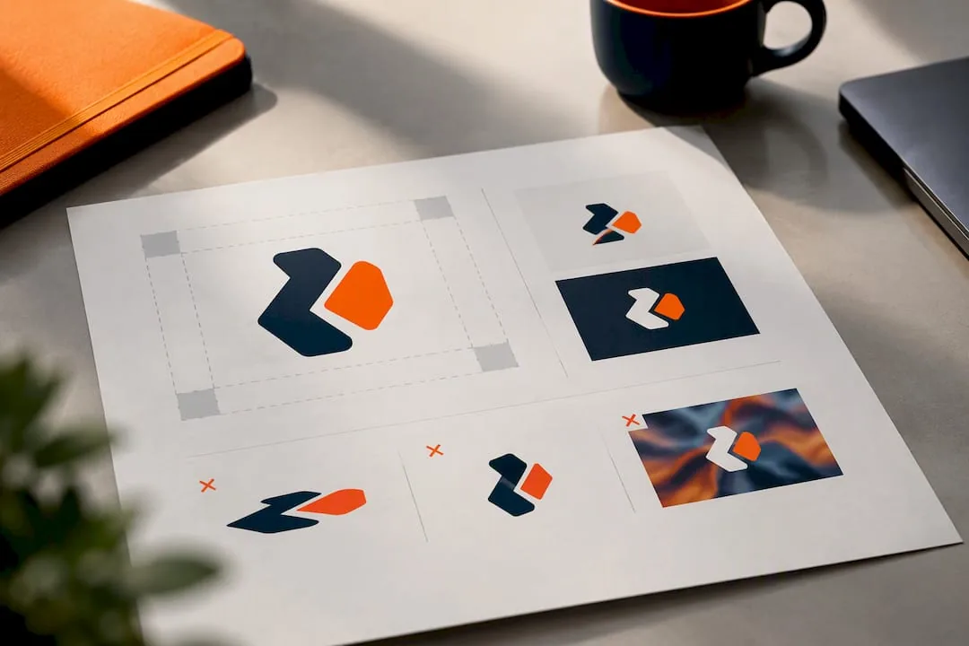
Pro Tip: Keep a one-page "misuse gallery" showing three real mistakes you've caught in the wild. It trains new hires faster than any written rule.
What colour codes should a brand guide specify?
Every primary colour needs four values documented side by side: hex for web, RGB for screens, CMYK for print, and Pantone for anything professionally printed. Skipping Pantone is the most common gap, and it's the one that causes a signage company to guess and get the shade wrong.
Secondary colours should only appear in supporting roles like backgrounds, charts, or icons, never as a replacement for the primary mark's colour. Set a minimum contrast ratio for text on colour so accessibility isn't an afterthought, and state a substitution rule up front: if a printer doesn't stock the exact Pantone ink, they should match to the nearest CMYK equivalent rather than eyeball it.
What typography rules keep text consistent everywhere?
List one primary typeface for headings and one secondary typeface for body copy, with the specific weights approved for each (for example, Bold for H1 to H3, Regular for paragraph text). Every licensed font needs a web-safe fallback named explicitly, because a developer without the licensed font file will otherwise default to Arial and nobody signed off on that.
- Primary typeface: heading weights (Bold, Semibold) plus its web fallback.
- Secondary typeface: body weight (Regular) plus its web fallback and a note on licensing terms.
- Type scale: approximate point sizes for H1 through H4, and a maximum line length for body text (roughly 60 to 80 characters reads best on screen).
- Display vs. text guidance: when a decorative or display font is allowed (hero headlines only) versus when body text must stay in the text typeface.
What imagery and icon rules belong in the guide?
Photography direction should describe lighting (natural light over harsh flash), subject framing (candid over posed where possible), and composition (negative space for text overlays). Give two or three quick "on" examples and two "off" examples so a photographer or stock-photo buyer can self-check without waiting on approval.
- Lighting: natural, soft shadows; avoid harsh overhead flash or heavy filters.
- Subjects: real people in context over generic stock poses.
- Icon grid: fixed pixel grid (commonly 24px or 48px) with consistent stroke weight across the set.
- Icon-to-type relationship: icon size should scale with the heading it sits beside, not float independently.
- Stock and illustration: permitted when it matches the photographic style, with the source credited in the asset filename or a linked spreadsheet.
How should voice and tone appear in a brand guide?
Write a one-sentence persona description first: something like "confident, plain-spoken, and never condescending." Then break tone by channel, because a brand that sounds identical on Twitter, in a support ticket, and in a press release usually sounds wrong in at least two of those places.
- Social media: conversational, first person plural, light humour allowed.
- Customer support: direct, empathetic, no jargon, always names the fix.
- Press and formal comms: measured, third person, no exclamation marks.
Include one do/don't rewrite as a worked example: don't write "Our innovative solution optimises your workflow"; do write "This tool cuts your invoicing time in half." Add a short messaging hierarchy, too, ranking your top three proof points so writers know which claim leads and which stays supporting evidence.
Pro Tip: *Give writers three approved headline templates and three approved call-to-action phrases.
What templates should teams have ready to use?
Prioritise the handful of files people actually touch every week over an exhaustive library nobody opens.
- Presentation deck, title slide, section divider, and data slide, with logo placement and approved chart colours locked in.
- Social media pack, square and vertical post templates with safe zones marked for text and captions.
- Email signature, name, title, logo, and one approved tagline, tested at actual screen width.
- Ad specs sheet, dimensions and file-size limits for the platforms you actually run ads on.
Name files with a simple convention, such as brandname_template_socialpost_v2.psd, so version confusion doesn't creep in after the third revision. Assign one person, usually a marketing lead or the founder, as the owner who reviews and approves any change request before a new version replaces the old one.
Where should brand assets live, and who maintains them?
Pick one source of truth. A shared drive or a dedicated brand-asset platform beats scattered files in someone's inbox. Set two permission levels: editors who can add or replace files, and viewers who can only download, so the primary logo file doesn't get overwritten by accident.
- Store final exports as SVG and EPS for print, PNG at 2x for web, and PDF for anything shared externally.
- Name files consistently:
brand_logo_primary_rgb.svg,brand_logo_reversed_cmyk.eps. - Review the guide roughly every 12 months, or immediately after a rebrand, with one named contact handling asset requests.
Why do these essentials actually move the needle?
Consistent, distinctive assets aren't decoration. They function as recognition triggers, and research on brand identity assets shows that only elements used prevalently and consistently earn that recognition over time. Brand equity research also ties recognition and perceived quality directly to pricing power and loyalty. In a market as fragmented as South Africa's, the Effie SA 2025 trends report found that clarity of intent, not sheer channel volume, drives campaign effectiveness. Juicy Designs applies that same discipline when building brand identity systems for clients.
What is brand purpose, and why does it anchor everything else?
Every element in a brand guide, from logo clearspace to a tone-of-voice rule, exists to serve one thing: the brand's purpose. Skip this step, and you'll end up with a guide full of correct colours and no reason for anyone to care about them.
Brand purpose is the answer to "why does this business exist beyond making money?" It's different from a mission statement, which describes what you do today, and different from a vision, which describes where you're headed. Purpose is the constant underneath both. A financial services firm's purpose might be "helping ordinary South Africans build wealth without jargon or gatekeeping." That single sentence should shape which stock photos get approved (real people, not boardroom stereotypes), which tone the support team uses (plain language, no condescension), and which headlines make the cut.
Write the purpose statement in one paragraph, no longer. Put it on page one of the guide, before the logo files, because everything that follows should trace back to it. If a new hire reads the purpose statement and can't tell what kind of imagery or language fits the brand, the statement is too vague to be useful.
For newer businesses, this section doubles as an internal alignment tool. Founders often carry the brand's purpose only in their heads, which works fine until the business hires its third employee or its first agency. Writing it down, even roughly, turns tacit knowledge into something a designer, copywriter, or social media manager can actually work from. It's the cheapest, highest-leverage page in the entire guide, and the one most businesses skip.
How do you make brand guidelines accessible?
Accessibility belongs in the guide itself, not as an afterthought bolted onto the website later. If your colour palette and typography choices don't meet basic contrast and legibility standards, every asset built from them inherits the problem.
Set a minimum contrast ratio for text against background colours, generally following the Web Content Accessibility Guidelines (WCAG) 2.1 AA standard, which calls for a 4.5:1 ratio for normal body text and 3:1 for larger headings. Document which of your palette combinations pass and which don't, so designers aren't testing this by eye on every new asset. A common failure point is placing white text over a light secondary colour because it looks good on a mockup; specify which combinations are banned outright.
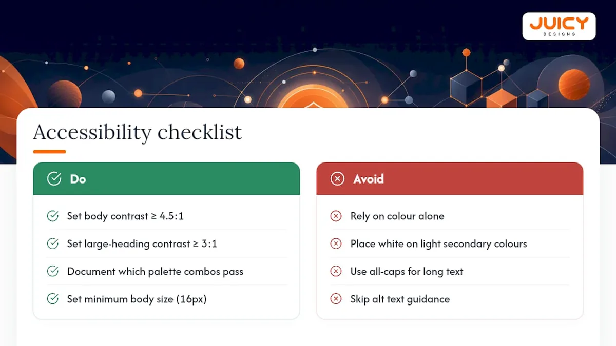
Typography needs accessibility rules too. Set a minimum body text size (commonly 16px for web), avoid all-caps for long passages since it slows reading comprehension, and never rely on colour alone to convey meaning (a red "error" label also needs an icon or the word "error" spelt out for colourblind readers).
For imagery, require alt text guidelines as part of the photography section, not as a separate technical afterthought. Specify who writes alt text, what tone it should take, and that decorative images still need an empty alt attribute rather than being skipped entirely. For video and social content, note whether captions are required by default, which most platforms now reward with better reach anyway.
Accessibility isn't a separate audience to design for. It's a baseline that makes every asset more usable for everyone, including someone reading your ad on a cracked phone screen in bright sunlight.
How should social media adapt the brand guide?
Social platforms break brand consistency faster than any other channel, mostly because each one has different image dimensions, different attention spans, and different cultural norms for tone. A social media style guide needs to translate the core guide into platform-specific rules rather than assume one asset fits everywhere.
Specify image and video dimensions per platform where they matter most to your business, since a square image cropped awkwardly on a story format undoes weeks of consistent design work. Note which platforms call for a more relaxed tone (casual language, emoji, first-person plural) versus which ones warrant something closer to your press voice. A social media style guide should cover logo placement on profile images, colour use in graphics, font choices for text overlays, and template designs sized correctly for each platform's current specs, since those specs change more often than most brand guides get updated.
Set explicit rules on hashtag use, emoji frequency, and posting cadence tied to the brand voice, not just the marketing calendar. A brand that positions itself as premium and understated shouldn't suddenly stack five emoji into a caption because a junior social media manager thought it would boost engagement. Include two or three real post examples, one that follows the guide correctly and one that doesn't, so anyone managing the account has a visual reference rather than a paragraph of abstract rules.
Update this section more frequently than the rest of the guide. Platform specs and content norms shift roughly every year, and a social section that's three years old is often actively wrong.
What rules govern co-branding and partnerships?
Co-branding situations, whether it's a sponsorship, a joint campaign, or a reseller putting your logo on their site, need explicit rules before the first request lands in someone's inbox, not after a partner has already misused your mark.
Set a clear hierarchy rule: which logo appears first or larger when two brands share a layout, and whether that changes depending on who's hosting the content (your website versus theirs). Specify a minimum clearspace between the two logos so they don't visually merge into a single confused mark. State whether partners are allowed to recolour your logo to match their palette (generally, they shouldn't be) and whether a combined lockup needs sign-off before it goes live anywhere public.
Require that any partner using your brand assets pulls files from your official source, never a screenshot or a resized copy from an old presentation. Low-resolution logos lifted from a PDF are one of the most common brand violations, and they're entirely preventable with a one-line rule: "request current files, don't reuse old ones."
Name who signs off on co-branded material internally, and set a turnaround expectation (48 hours is reasonable for most small teams) so partnerships don't stall waiting on approval. If your business regularly works with resellers or affiliates, consider a short one-page addendum specifically for that group, since their usage patterns differ from a one-off campaign partner's.
What legal points must a brand guide cover?
A brand guide isn't a legal document, but it should point people towards the legal facts that protect the brand, and flag where guesswork turns into liability.
State whether your logo, name, or tagline is a registered trademark, and if so, note the registration basics (which office, which classes of goods or services it covers) so anyone drafting a partnership agreement knows what's actually protected. If registration is pending or hasn't happened yet, say so plainly rather than implying a protection that doesn't exist yet.
Cover copyright on your photography, illustrations, and templates: who owns the work (the business, a contracted photographer, a stock library), and what a staff member or agency is and isn't permitted to do with it. If you license stock photography or fonts, note the licence type in the guide itself, since a font licensed for personal use can create real problems if it ends up in a printed billboard campaign.
Include a short statement on how to request permission to use brand assets outside normal business operations, such as a journalist wanting the logo for an article or a student wanting it for a case study. A one-line contact instruction here avoids ad hoc replies that might unintentionally grant broader rights than intended.
None of this replaces proper legal advice for trademark filing or dispute resolution. But naming the basics in the guide means fewer surprises land on a lawyer's desk later, and fewer accidental infringements happen simply because nobody knew the rule.
What other dos and don'ts round out a brand guide?
Beyond the logo, most brand inconsistency comes from layout, spacing, and background choices that nobody wrote down because they seemed obvious to whoever designed the first template.
Set a consistent grid or margin system for documents and social posts, even a simple one, so spacing doesn't vary wildly between someone using PowerPoint and someone using Canva. Specify minimum padding around text blocks and images, since cramped layouts are one of the fastest ways an otherwise on-brand asset looks amateur.
Address backgrounds directly: which colours or textures are approved behind the logo and text, and which are banned outright (busy patterns, clashing brand colours stacked together, low-contrast combinations that swallow the text). If your brand allows photography as a background, state a minimum darkness or overlay requirement so text stays legible regardless of what's happening in the photo underneath it.
Cover alignment rules too: left-aligned body text reads more naturally than centred paragraphs beyond a line or two, and mixing alignment styles within a single document reads as unpolished even when every other element is correct. A short "do this, not that" visual pairing, similar to the logo misuse gallery, works better here than a paragraph of rules, since layout mistakes are easier to spot than to describe.
A short, practical priority plan for teams on tight budgets
If budget is tight, lock down logo files, basic colour codes, and three templates first. Use templated social packs and licensed stock with one consistent style. Roll the guide out internally over two weeks, not two months.
, Cobus
Get your brand guidelines built properly
Reading a checklist is one thing; producing print-ready files, a working colour system, and templates your team will actually use is another. A digital marketing agency handles the deliverables this article just walked through directly, without account managers or handoffs between departments. Branding and identity work starts from R15,000 once-off, covering the logo suite, colour palette, and typography system a proper guide needs. Need ongoing production once the guide exists? Graphic design support runs R650 per hour for templates, ad specs, and social packs as they come up. If you already have a rough guide and just need it tightened into something an agency or new hire can actually follow, get in touch through the contact page and describe what you're working with. We'll tell you honestly what's missing before you spend a rand.
Sources
- Brand Identity Assets - Leading Edge Research
- Brand Equity Research Services South Africa | Meraki Research
- Effie South Africa 2025 trends report (in partnership with Ipsos)
FAQ
What do you need for brand guidelines?
At minimum, you need a purpose statement, a logo suite with clearspace rules, documented colour codes (hex, RGB, CMYK, Pantone), a typography system with web fallbacks, imagery and voice direction, a few ready-to-use templates, and a named owner for approvals. Skipping any of these usually shows up later as inconsistent assets across print and digital.
What are the 5 C's of branding?
Definitions vary across sources, but a commonly used version covers clarity, consistency, credibility, competitiveness, and connection to the customer. Treat it as a lens for reviewing your guide rather than a strict checklist, since no single official version dominates industry usage.
What are the 7 pillars of branding?
Similar to the 5 C's, this framework isn't standardised across the industry, and different agencies define the seven pillars differently. Rather than chasing a specific numbered list, focus on the essentials this article covers: purpose, logo, colour, typography, imagery, voice, and templates, which map closely to most versions you'll find.
What are examples of brand guidelines?
Public examples include SAIPA's member brand guideline, which documents logo spacing and colour specs for a professional body, and general how-to frameworks like Adobe's guide to building a brand style guide. Juicy Designs builds this same structure into client brand identity projects, tailored to each business's actual asset needs rather than a generic template.
How much does it cost to get brand guidelines made professionally?
Juicy Designs prices branding and identity work from R15,000 once-off, which covers the core deliverables a usable guide needs: logo suite, colour palette, and typography system, listed on the pricing page. Ongoing template or asset production is billed separately at R650 per hour for graphic design work.
Recommended
- What Makes a Good Logo? Design Principles
- Famous Logos and the Design Lessons Behind Them
- How to Design a Brand Identity From Scratch (SA Guide)