
30/60/90 Roadmap: 7 Fixes to Improve Website Conversion for SMBs
A practical playbook for SMBs: seven quick fixes, a 30/60/90 roadmap, and 2026 benchmarks so you get measurable conversion lifts in weeks.
Measure one conversion metric, fix the single biggest friction point, and run one test.


TL;DR: Quick Answer
A practical playbook for SMBs: seven quick fixes, a 30/60/90 roadmap, and 2026 benchmarks so you get measurable conversion lifts in weeks.
Measure one conversion metric, fix the single biggest friction point, and run one test. That's the fastest way to improve website conversion, and it works because most sites lose visitors to the same three problems: weak messaging, clunky forms, and slow pages. Fix messaging match, reduce form friction, and tighten speed and mobile performance, and you'll typically see quick wins within days. Structured testing then compounds those gains over the following months.
TL;DR:
- Fix message match, reduce form fields, and improve page speed before running multiple A/B tests to maximise quick conversion wins with minimal effort.
- Focus on primary conversion actions, measure funnel drop-offs, and interpret heatmaps and recordings to identify and eliminate visitor friction points effectively.
- Use specific, verifiable social proof and logitically simple, single-CTA landing pages tailored to visitor intent for higher engagement and trust.
- Prioritise fixing the biggest friction points first, as most gains come from optimising messaging, speed, and form friction, not from redesigns or minor copy tweaks.
- Implement exit-intent popups and remarketing campaigns after fixing core issues to recover visitors and boost overall conversion rates over time.
Prioritised quick wins you can apply this week
You don't need a redesign to move the needle. Most conversion gains come from fixing what's already broken, not building something new. Here's the order that gets results fastest, based on which fixes affect the most visitors with the least engineering effort.
- Rewrite your headline to match your traffic. If someone clicked a Google Ad for "affordable bookkeeping services," your landing page headline should say exactly that, not a generic "Welcome to Our Company." Mismatch between what people expect and what they land on is one of the most common conversion killers, particularly on paid traffic.
- Strip your forms down to the essentials. Every field beyond name, email, and one qualifying question costs you leads. Cut fields you don't strictly need for the first touch.
- Add inline validation. Show errors as people type, not after they hit submit and lose everything they entered.
- Put your CTA above the fold and repeat it. One clear action, phrased as a benefit ("Get Your Free Quote" beats "Submit"), visible without scrolling and again further down the page.
- Add one credible trust signal near the CTA. A named testimonial with a measurable result, a client logo, or a specific case metric outperforms vague claims like "trusted by many."
- Run a speed audit and fix the top three issues. Compress images, defer unnecessary scripts, and check your hosting response time.
- Set up one A/B test on your headline or CTA. Don't test five things simultaneously. Pick the change most likely to matter and measure it properly.
A structured B2B playbook built around seven recurring issues, message mismatch, form friction, slow pages, weak social proof, unclear CTAs, vague value propositions, and poor mobile UX, consistently shows these fixes deliver measurable lifts without a full rebuild. That matches what we see across dealership, retail, and professional services sites in South Africa: the quick wins are rarely glamorous, but they're the ones that move the number.
Pro Tip: Before you touch design, screen record five real visitor sessions. You'll usually spot your biggest friction point in under twenty minutes, and it's often something nobody on the team noticed.
Once these seven fixes are live, you're in a position to test deliberately rather than guess. That's where the roadmap in the sections below comes in.
What should you measure to benchmark conversion performance?
Pick one primary conversion action before you optimise anything. For an ecommerce store that might be a completed purchase. For a service business, it's usually a form submission or booked call. Everything else, cart adds, newsletter signups, PDF downloads, is a secondary or micro conversion that supports the main goal but shouldn't distract from it.
Break your funnel into stages so you know where visitors actually drop off: visitor to lead, lead to marketing-qualified lead, MQL to sales-qualified lead, and SQL to closed deal. A site can look "broken" at the top when the real leak is between lead and MQL, where sales never follows up fast enough.
Three tools cover most of what you need:
- Google Analytics 4 for traffic sources, goal completions, and funnel drop-off by channel and device.
- Hotjar or Microsoft Clarity for session replays and click maps that show where people hesitate or abandon.
- PageSpeed Insights or WebPageTest for load time and Core Web Vitals, since speed problems distort every other metric you track.
Benchmark reality check: Ecommerce conversion rates average between 1.8% and 3.34% depending on channel and device, with mobile typically converting lower than desktop and organic traffic often outperforming paid on intent-driven searches.
That range matters because a flat "good conversion rate" doesn't exist independent of your industry, traffic source, and device mix. Compare your numbers by channel and device weekly, and review campaign-level performance separately since a strong overall average can hide a paid campaign quietly losing money.
Do your landing pages match what visitors expect?
Every landing page needs one primary goal. A page trying to sell a product, collect an email, and promote a webinar simultaneously usually does none of them well. Pick the single action you want that visitor to take and design everything around it.
Your headline should mirror the ad or search query that brought the visitor there. This is the same message-match principle behind the quick win above, but at the campaign level it becomes systematic: every ad group or keyword cluster should point to a page whose headline echoes that specific intent, not a generic homepage.
Above the fold, keep the structure simple:
- A headline that restates the visitor's intent
- A subheadline that adds one specific benefit or differentiator
- One clear CTA, visually distinct from the rest of the page
- A single trust element (review count, client logo, or guarantee)
Landing pages built around a single audience segment and a clear CTA consistently outperform pages trying to serve multiple traffic sources at once. If you're running Google Ads for three different services, build three landing pages, not one page with three headlines competing for attention.
For visitors who aren't ready to commit, add a micro-conversion: a downloadable guide, a short quiz, or a "compare options" tool. Our own breakdown of landing page anatomy covers this hierarchy in more depth if you want a template to work from.
How do you reduce form abandonment without losing lead quality?
Long forms are a conversion tax. Every additional field past the essentials measurably reduces submissions, and most of that lost information wasn't needed at the first touch anyway.
Keep your initial form to three fields: name, email, and company (or a single qualifying question relevant to your business). Use progressive profiling to collect the rest later, through a follow-up email, a second-step form after signup, or a quick call. Server-side enrichment tools can fill in firmographic details like company size or industry automatically, so your sales team gets the context without making the visitor type it.
A few practical rules that consistently improve both completion rate and lead quality:
- Show inline validation immediately, not after submission
- State clearly what happens with the visitor's data ("We'll never share this" or a one-line privacy note)
- Test every form on an actual phone, not just a resized browser window; tap targets and autofill behaviour differ meaningfully on mobile
- Track lead-to-opportunity conversion internally, not just raw form fills, since a shorter form can increase submissions while quietly lowering the percentage that turn into real sales conversations
Pro Tip: If your sales team complains that "leads are worse now" after you shortened a form, check lead-to-opportunity rate before reverting. Often the volume goes up, quality holds steady, and the complaint is really about handling more leads, not worse ones.
Our guide to optimising web forms walks through field-by-field examples if you want to see this applied to a real form layout.
Why does page speed affect conversion more than most sites realise?
Speed isn't a technical nicety. It's a conversion lever with an outsized effect on mobile, where patience runs out fast and a slow load pushes visitors straight back to search results.
Load time delays measurably erode conversion, and testing tools like WebPageTest consistently show that even a one-second improvement in load time can shift bounce rate and completion rate in ways that dwarf most copy or design tweaks.
Four fixes typically account for most of the improvement:
- Compress and serve images as WebP or AVIF instead of uncompressed JPEG or PNG files
- Defer non-critical JavaScript so the page becomes interactive before every script has finished loading
- Use a CDN and enable browser caching to cut server response time for repeat visitors
- Fix mobile tap targets and layout shift so buttons don't jump around while a page finishes rendering, which frustrates visitors and triggers accidental mis-taps
Run PageSpeed Insights and WebPageTest side by side, since they measure slightly different things, and implement whichever three recommendations show the biggest projected improvement rather than trying to fix everything on the report. Diminishing returns set in quickly past the top handful of issues.
What social proof actually convinces buyers?
Vague trust claims don't move anyone. "Trusted by hundreds of clients" reads as filler. A named testimonial with a role and a specific number, "Increased qualified leads by 40% in three months, says the marketing manager at a mid-sized retailer", carries far more weight because it's checkable and specific.
Placement matters as much as content. Put your strongest proof element near the CTA, not buried in a separate testimonials page nobody visits. A few placements that consistently perform:
- Client logos directly below the hero section, especially recognisable local names
- A single case-study snippet with a measurable outcome next to the main CTA
- Third-party review badges (Google Reviews, industry-specific directories) with a link visitors can verify
- A specific, honest guarantee rather than manufactured urgency like a fake countdown timer
Following Stanford's web credibility research, specificity and verifiability drive trust far more than volume of claims. One detailed, checkable proof point beats five generic ones, and fabricated urgency tends to erode trust once visitors notice the countdown resets every time they refresh the page.
How do you run A/B tests that actually tell you something?
Random testing wastes traffic. Structure every experiment as a hypothesis before you build it: "We believe changing the headline to state the specific benefit will lift form completions by a meaningful margin for paid search visitors, because our session recordings show visitors bouncing within five seconds of landing."
That format forces you to name the change, the metric, the segment, and the evidence behind your guess, which makes the result easier to interpret whether the test wins or loses.
- List every idea you're considering, then score each on Potential impact, Importance, and Ease (PIE) or Impact, Confidence, Effort (ICE). Test the highest-scoring idea first.
- Check your traffic volume before committing to a runtime. Low-traffic SMB sites often need several weeks to reach a reliable sample, while high-traffic pages can validate a test in days. Don't call a winner early just because one variant looks ahead after two days.
- Tie the test to revenue-per-visitor where possible, not just click-through rate, since a headline that generates more clicks but lower-quality leads isn't actually a win.
- Roll winners out to the full segment they were tested on, document null results honestly, and move to the next hypothesis rather than re-running a flat test hoping the numbers shift.
Systematic B2B testing frameworks consistently link experiment success to revenue-per-visitor tracking rather than surface metrics, which matters most for SMB sites where every visitor is expensive to acquire.
Pro Tip: If your traffic is too low for a formal split test, use session replay tools to validate a change qualitatively first. Watching ten sessions after a change often reveals whether it's working long before you'd hit statistical confidence.
A 30/60/90 day roadmap for conversion improvement
Turning tactics into a schedule keeps the work from stalling after the first burst of enthusiasm. Here's a realistic sequence based on how B2B sites typically diagnose and fix conversion problems:
- Days 1 to 7: Run your analytics and speed audits, identify your primary friction point, and implement the fastest fixes, form field reduction, headline rewrite, image compression.
- Days 8 to 30: Launch your first properly structured A/B test, add trust signals near your main CTA, and fine tune form fields based on early completion data.
- Days 31 to 90: Iterate on test results, introduce personalisation for your top two or three traffic segments, and shift your internal reporting towards lead quality rather than raw volume.
- Ongoing: Report progress with a simple dashboard, conversion rate by channel, lead-to-opportunity rate, and page speed, updated monthly so leadership sees the trend, not just a snapshot.
A CRO checklist built for South African websites maps closely to this sequence if you want a version you can hand to your team directly.
What a founder-led agency sees across real client sites
I'm Cobus, and Juicy Designs runs on a founder-led model, which means the person auditing your site is the same person accountable for the result. That sequencing matters more than most owners realise: audit first, fix the obvious friction, then test, rather than jumping straight to a redesign because the current site "feels old."
Juicy Designs clients average a 4.8x return on ad spend, nearly double the industry standard, and our full-funnel work for a Pretoria dealership group delivered a 312% increase in qualified leads (see the portfolio).
Neither of those numbers came from a full rebuild. They came from finding the specific friction point, in that case a mismatch between ad messaging and landing page headlines, plus a form asking for far more than the dealership actually needed at first contact. The roadmap above isn't theoretical. It's the order we actually work in.
How exit-intent popups and remarketing recover lost visitors
Most visitors leave without converting no matter how well your page is built. Exit-intent popups and remarketing exist to capture a second chance rather than let that traffic disappear entirely.
An exit-intent popup triggers when someone's cursor moves towards the browser's close or back button, offering one last reason to stay: a discount, a lead magnet, or a simplified version of your main offer. Keep it to a single, specific ask. A popup offering five different things at once usually gets dismissed instantly. The strongest performers tend to offer something genuinely useful, a checklist, a quote, a comparison guide, rather than a generic "wait, don't leave!" message with no real value attached.
Remarketing picks up where the popup leaves off. Once a visitor leaves without converting, targeted ads on Google or Meta can bring them back with a message tailored to what they actually looked at, a specific product page, a service they browsed, rather than a generic brand ad. This works particularly well for higher-consideration purchases where visitors research before buying, since the first visit is rarely the conversion moment anyway.
Both tactics work best paired with the friction fixes covered earlier. A remarketing campaign driving traffic back to a slow, confusing page just burns budget twice. Fix the page first, then use exit-intent and remarketing to recover visitors who would otherwise be gone for good.
Which psychological principles actually drive online decisions?
Visitors don't make purely rational decisions, and understanding the shortcuts people use to decide helps explain why certain page elements consistently outperform others.
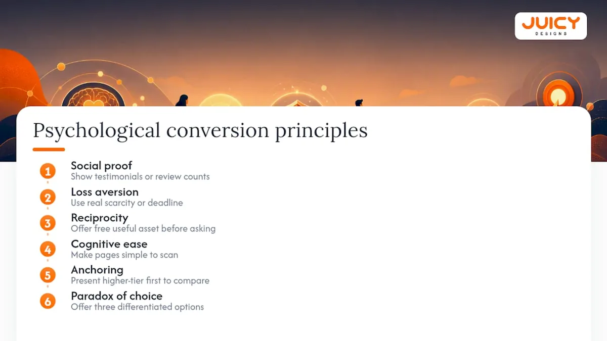
Social proof works because people look to others' behaviour when they're uncertain, which is why a specific testimonial or review count reduces hesitation more than a bold claim about quality. Loss aversion explains why "limited stock" or "offer ends Friday" can lift conversions, provided the scarcity is real; fabricated urgency tends to backfire once visitors catch on, and it damages trust for every future visit.
The principle of reciprocity shows up in lead magnets: offering something useful for free, a guide, a quote, a checklist, before asking for a sale makes visitors more receptive to the eventual ask. Cognitive ease matters too. A page that's simple to scan and understand converts better than one packed with jargon, because confused visitors don't convert, they leave.
Anchoring affects how pricing is perceived: showing a higher-tier option first makes a mid-tier price look more reasonable by comparison. And the paradox of choice means offering three well-differentiated options usually converts better than offering eight nearly identical ones, since too many choices increase hesitation rather than satisfaction.
None of this means manipulating visitors. It means presenting real information, real proof, real scarcity, and real value in a way that matches how people naturally process decisions.
Why does responsive design matter beyond phone screens?
Mobile optimisation gets most of the attention, but responsive design is bigger than making a page fit a phone screen. It means your layout adapts sensibly across tablets, laptops with different resolutions, foldable devices, and the growing number of visitors browsing on smart TVs or in-car browsers.
A page that only accounts for "desktop" and "mobile" often breaks on a tablet held in portrait mode, or on a laptop with a smaller screen than the designer tested on. Elements overlap, buttons shrink to unusable sizes, or critical content gets pushed below multiple scrolls.
Beyond layout, responsive design affects load behaviour. Serving a desktop-sized image to a mobile connection wastes bandwidth and slows the page, directly undercutting the speed fixes covered earlier. Proper responsive implementation serves appropriately sized assets per device, not just a resized version of the same file.
It also affects interaction design, not just appearance. Touch targets need adequate spacing on tablets and phones, hover-based menus that work on desktop need a tap-friendly alternative on touchscreens, and forms need input types (numeric keyboards for phone fields, for example) that match the device being used. Test your site on an actual mid-range Android phone and an older iPad, not just the newest iPhone in a design tool's preview mode. That's usually where responsive design quietly fails.
What copywriting changes actually move conversion numbers?
Copy is often the cheapest, fastest lever available, and it's frequently the most neglected. A few adjustments consistently outperform generic marketing language.
Lead with the visitor's problem, not your company's history. "Struggling to get qualified leads from your website?" earns more attention than "We are a full-service digital marketing agency." Visitors decide within seconds whether a page is relevant to them, and that decision hinges on whether the first line addresses their situation.
Replace vague adjectives with specific outcomes. "Fast turnaround" says nothing measurable; "Quotes delivered within 24 hours" gives visitors something concrete to evaluate. The same applies to CTAs: "Get Your Free Quote" consistently outperforms a flat "Submit" or "Learn More" because it restates the benefit at the exact moment of action.
Write for the reading level of your actual audience, not to sound impressive. Short sentences, plain words, and a clear structure convert better than dense paragraphs stuffed with industry jargon, particularly on mobile where visitors skim rather than read closely.
Finally, address objections before visitors have to ask. If price is a common hesitation, mention your value proposition near the price point. If trust is the barrier, place your strongest proof element right next to the CTA rather than hoping visitors scroll down to find it on their own.
How does personalisation improve conversion across segments?
Different visitors arrive with different intent, and a single generic page serves none of them particularly well. Personalisation means adjusting content, offers, or messaging based on what you already know about a visitor's segment.
The simplest form is traffic-source personalisation: a visitor arriving from a Google Ad for "emergency plumbing" should see different headline copy than one arriving from an organic search for "plumbing maintenance tips," even if they eventually land on related pages. Location-based personalisation works similarly, referencing a visitor's city or region when relevant to the offer.
Behavioural personalisation goes further, adjusting content based on what a visitor has already viewed. Someone who's browsed three product pages without converting might see a different CTA (a discount, a comparison tool) than a first-time visitor. Interactive, role-matched demo experiences have shown meaningfully higher engagement than static one-size-fits-all content, because visitors respond better when the experience reflects their specific role or intent rather than a generic walkthrough.
Segment-based email and remarketing follow-up extends this beyond the first visit. A visitor who downloaded a pricing guide should get a different follow-up sequence than one who only viewed the homepage. Start simple: pick your two or three highest-value segments and personalise just the headline and CTA before attempting anything more elaborate.
What do heatmaps and session recordings actually reveal?
Analytics tell you what happened. Heatmaps and session recordings tell you why. That distinction matters because a drop-off number in GA4 doesn't explain whether visitors got confused, distracted, or simply weren't interested.
Click maps and scroll maps show where attention actually goes on a page, often revealing that a supposedly important CTA sits below where most visitors ever scroll, or that people are clicking on an element that isn't even a link because it looks clickable. Tools like Hotjar or Microsoft Clarity generate these automatically once installed, with no development work required.

Session recordings go further, showing individual visitor journeys in real time. Watching someone hover repeatedly over a form field, hesitate, then abandon reveals friction that no aggregate metric would surface on its own. For SMB sites with limited traffic, this qualitative approach is often more useful early on than a formal split test, since a handful of watched sessions can validate or kill an idea before you commit weeks to running a statistically valid experiment.
Look for patterns across at least ten to fifteen sessions rather than drawing conclusions from one or two recordings, since individual visitor behaviour varies. Once a pattern repeats consistently, whether it's confusion over a specific label or consistent abandonment at the same form field, you've found a legitimate fix, not a guess.
What most conversion advice gets backwards
Most conversion advice treats testing as the starting point. It isn't. The evidence across the tactics above points somewhere else: fix the obvious friction first, then test to confirm and refine. A/B testing a headline on a page that loads in six seconds on mobile is testing around a problem you already know exists.
The other place conventional advice falls short is treating every fix as equally urgent. It isn't. Message match, form friction, and page speed account for most of the lift on typical SMB sites, and chasing smaller wins, button colours, minor copy tweaks, before those three are solid usually wastes time relative to the return.
If you take one thing from this playbook, prioritise ruthlessly. Audit first, fix the two or three biggest friction points, then test. Skipping straight to testing, or worse, to a full redesign, is how most conversion projects stall without ever producing a number worth reporting to leadership.
, Cobus
How Juicy Designs can help you turn this into results
Reading the playbook is one thing. Implementing it properly, with the right test structure, the right form logic, and a page speed baseline that actually holds under real traffic, is where most SMB teams run out of time. Juicy Designs works as a founder-led alternative to the typical agency retainer: you deal directly with the person accountable for your results, not an account manager relaying requests to someone else.
Our services cover conversion rate optimisation, landing page design, Google Ads management, and analytics setup, with flexible pricing and no long-term contracts to allow adjusting spend as results come in. If you want a professional audit of where your site is losing conversions right now, start with our full-service digital marketing services and we'll show you exactly where the friction is before recommending a single change.
Sources
- 2026 industry conversion rate benchmarks you need to know
- B2B Conversion Rate Optimisation: The 2026 Playbook (Real Tactics, Real Numbers) | Dupple
- WebPageTest
FAQ
Is a 12% conversion rate on a website good?
For most industries, yes, that's exceptional. It's well above the typical 1.8% to 3.34% ecommerce average, though rates that high usually come from highly qualified traffic, branded search, or email lists, rather than broad cold traffic.
Is 2.5% a good conversion rate?
It sits within the normal ecommerce benchmark range and is reasonable for mixed traffic sources. Whether it's "good" depends on your specific channel and device breakdown, since paid mobile traffic typically converts lower than organic desktop traffic.
What are the core principles behind conversion rate optimisation?
The core principles are message-to-traffic match, minimal form friction, page speed, credible social proof, a clear single CTA, an unambiguous value proposition, and mobile usability. These seven areas account for most measurable conversion lifts on typical business sites.
How can I optimise the conversion rate of my website?
Start by measuring your primary conversion action and identifying your biggest friction point through analytics and session recordings, then fix messaging, forms, and speed before running structured A/B tests. Agencies like Juicy Designs can run this audit-and-fix sequence for you if you'd rather have it handled directly.
How long does it take to see conversion improvements?
Quick wins like form reduction, headline rewrites, and speed fixes often show measurable change within one to two weeks. Structured A/B testing and personalisation typically need 60 to 90 days to produce reliable, repeatable gains.
Recommended
- A CRO Checklist for South African Websites (2026)
- Ecommerce CRO Tips: Convert More Shoppers
- Web Design for SEO, Conversions and Marketing
- 11 CRO Test Ideas With Real Conversion Lifts